Elevate Your Online Presence with Tailored Website Templates for Health, Wellness & Holistic Professionals
About the Author:
Hi, I’m Ingrid — founder of Hello CoCreator. I know what it’s like to juggle big ideas, a growing business, and a million to-dos. That’s why I help creative business owners simplify their branding and websites, creating visuals and experiences that make their business feel easier to run.
Showit Website Templates
Popular Post:
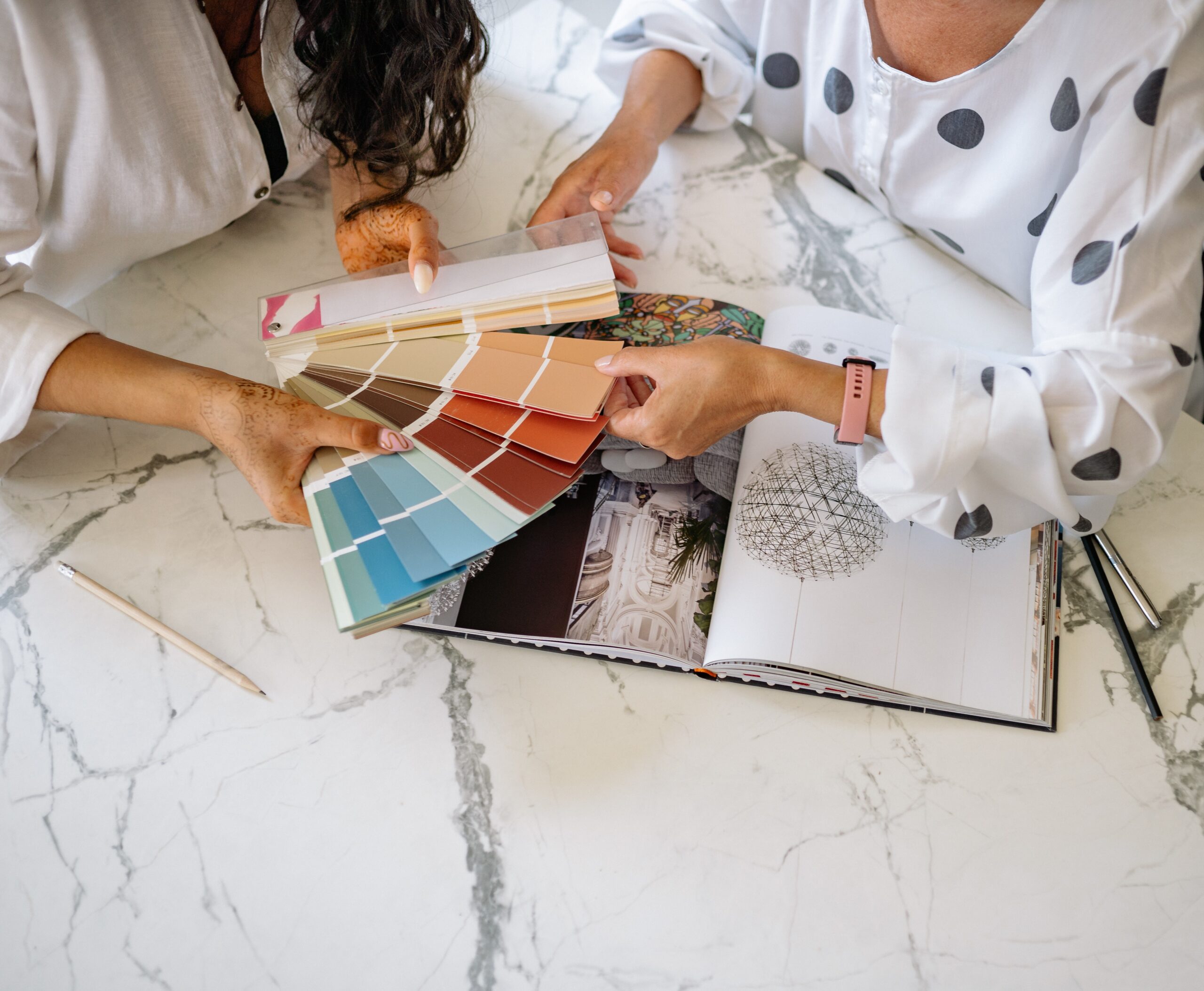
When it comes to choosing the right color palettes for wellness brands, it requires certain understanding of colors as a crucial step in creating a Brand Visual identity that resonates with your audience and also reflects the true essence of your brand.
Colors can evoke emotions, convey messages, and influence perceptions. In this article, we’ll explore the colors palettes for Wellness brands and additionally ideal colors for fitness brands.
Colors Associated with Wellness
The colors associated with wellness are typically calming, soothing, and reflective of a holistic approach to health and well-being. Here are some color palettes for wellness brands with examples:
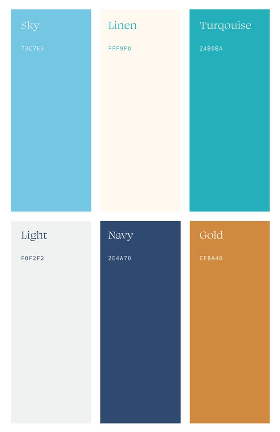
1. Blue
Blue is often associated with tranquility, trust, and serenity. It’s a color that can promote a sense of calmness and relaxation, making it a popular choice for wellness brands. Blue is also linked to the water element, which symbolizes flow and balance.
2. Green
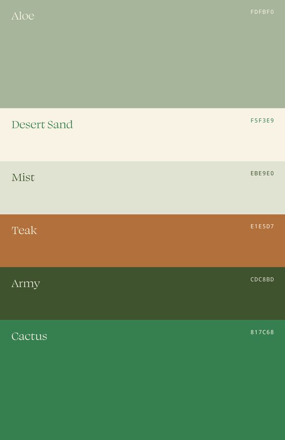
Green is closely tied to nature and represents growth, renewal, and harmony. It’s a color that resonates with those seeking a balanced and healthy lifestyle. Wellness brands often use shades of green to convey a connection to the natural world and a commitment to sustainability.
3. Purple
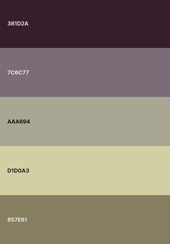
Purple is associated with spirituality, mindfulness, and introspection. It represents a sense of inner peace and transformation. For wellness brands that focus on meditation, yoga, or spiritual well-being, shades of purple can be an excellent choice.
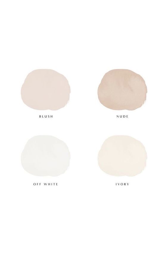
4. White
White symbolizes purity, clarity, and simplicity. It’s often used to convey a sense of cleanliness and freshness, which is essential in many wellness-related industries, such as skincare and holistic health.
Colors for Fitness Branding
Fitness branding often requires colors that inspire action, energy, and motivation. Here are some colors commonly used in fitness branding:
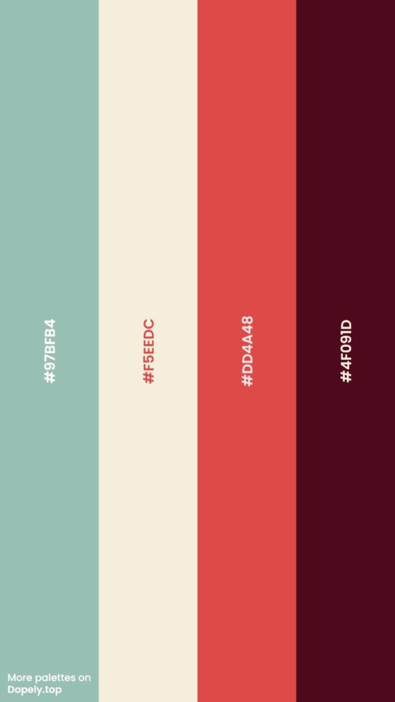
1. Red
Red is a powerful color that evokes passion, energy, and determination. It’s an excellent choice for fitness brands that want to ignite motivation and drive. However, use it sparingly as it can be intense.
2. Orange
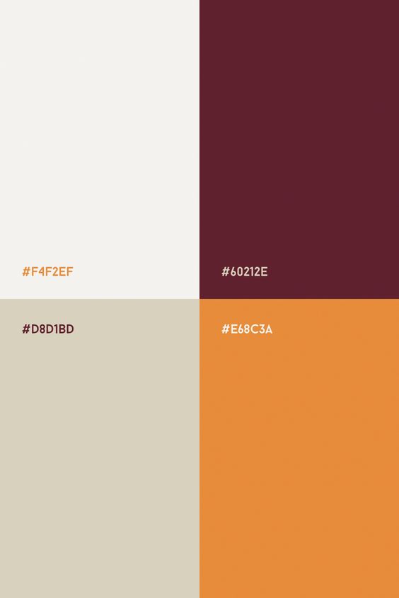
Orange combines the energy of red and the optimism of yellow. It represents enthusiasm and vitality. Many fitness brands incorporate orange to create a sense of excitement and enthusiasm among their audience.
3. Black and White
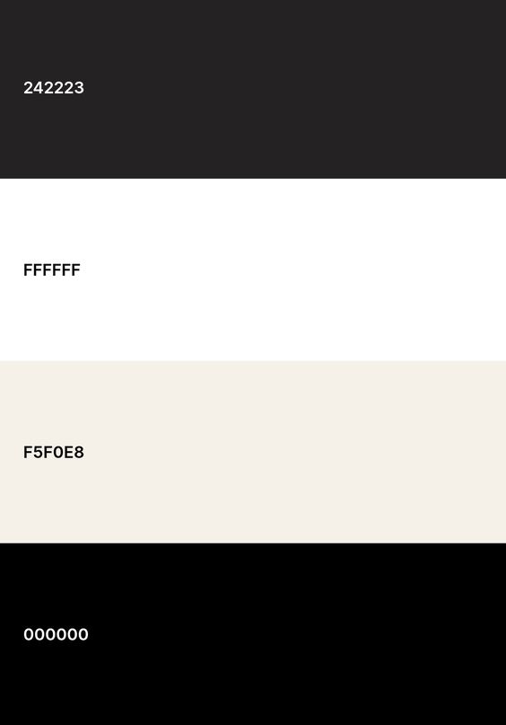
Black and white can create a sleek and modern look for fitness brands. These colors represent balance and simplicity. They are often used in combination with bold accent colors like red or orange to create a visually striking brand image.
In conclusion, the choice of color palette for your wellness or fitness brand should align with your brand’s values and the emotions you want to evoke in your audience. Whether you opt for calming blues and greens or energetic reds and oranges, the right color palette can play a significant role in building a strong and memorable brand identity.
Ready to create your wellness brand’s visual identity?
You can check our custom branding services to help you bring your identity live, if you are curious about our pre-made templates check out the Brenda Template and Gloria Template created with Showit to kickstart your brand’s design journey.
Remember that your brand’s colors should not only look good but also convey the essence of your wellness or fitness mission. Choose wisely, and you’ll leave a lasting impression on your audience.
Transform Your Brand and Website with us!
Subscribe to our newsletter for the latest tips on branding, website design, and exclusive offers. Stay ahead with insights on how to create a stunning health and wellness website that stands out. Be the first to know about our new services, templates, and special promotions. Join our community and elevate your online presence today!
Join us!
Read next:
Elevate Your Online Presence with Tailored Website Templates for Health, Wellness & Creative Professionals.
DISCOVER OUR TEMPLATES
Brenda Showit Template
Showit Website Templates
©2025 HELLO COCREATOR | All Rights Reserved
